Description:
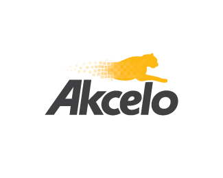
This company is all about developing simple, easy-to-use, but yet, functional software
that people enjoy using. Akcelo means to accelerate, so I thought the Cheetah represented that well. :-)
Status:
Client work
Viewed:
9786
Share:



Lets Discuss
Update.
Replyim so glad you've come back to this kev, but i prefer the new version (JOKE) no i really like this, im going to be honest kev, in my humble opinion its not there yet, %26 it's going to be tough getting this concept right but i envy you %26 admire your courage, fortune favours the brave %26 i wish you all the fortune in this %26 everything you do dude. go get it boy! your friend nido.
ReplyThanks, buddy. I completely appreciate your honest feedback. How else do we get better at this stuff, right? I will make this one work!! Thanks for the motivation. :-)
ReplyStunning ... simply put ... lots of possible ideas with placement as well is this the final version ?
Replyand nido great suggestions, you ideas man you !!!
Reply:p
Reply@ kaimere: Just about. Type is under development. I want to try and minimize the negative space between the 'A' and the 'K'. Have a few ideas in mind. Suggestions on layout are still welcome. Thanks very much, Kaimere. Your feedback is always appreciated.**Thanks to everyone else for all the help and motivation. I can't thank YOU enough!! I am learning so much as a new designer.
Replywhat about making the head stick out more, making it more agressive?
ReplyHey, Kevin. %0D*I really liked the concept behind the logo, but the cheetah looks like he's resting, not accelerating/running.%0D*
ReplyThanks for the comments. The final can be seen here (colors still being tweaked). http://farm1.static.flickr.com/206/466394032_056f5635b0_o.jpg**The type is now 100%25 custom. The previous 'A' just wasn't working for me. Neither was the 'C' or the 'O'. I feel the flow has been improved. Also, the direction of the 'A' gives the logo more movement and a sense of speed. %3D)
Replyhttp://misipile.com/ logo 128... the same idea.
ReplyAnd?
Replylogo not good
ReplyThanks for your opinion.
ReplyGentleman!! %3B)
ReplyLove these guys that just join with nothing but hate.
Reply@hungboney, logo not good? english not good ether... put your money where your mouth is and put one of your designs up for a little critique tlc.
Replyhungboney? Probably hung like an ant. Thanks for the support, guys.
Replyocularink, you are a great person. I also think that criticizing should be constructive not destructive. The final version looks great, and i like the cool effect you added, and yes it looks like running..the a-k also emphasize the idea, so i think it's a very well done one. As a suggestion: client's opinion is always no.1, for each one of use, even if we want or think or wish different. The animal was chosen excellent, and also i love the font.**@people with useless critiques: do you do this (designing, creating, copying artworks, masterpieces) for money of as a passion and style of living?
Replysorry for the nervous spelling errors...lol
ReplyNo apologies necessary. Thanks for your comment, Claude. I agree about constructive criticism. Simply stating %22logo not good%22 is very immature.
Replydefinitely. we are here to grow, to improve ourselves. I truly belive that here, on logopond is a big family :p
ReplyWent to the last page of comments and saw this. I love it!
ReplyThanks, Tab!
ReplyPlease login/signup to make a comment, registration is easy