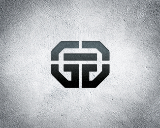
Global Feature
by OcularInk • Uploaded: Nov. 25 '06 - Gallerized: Mar. '10

Float
(Floaters:
52 )
Description:
This logo concept was created in early last year. It was rejected by the client. Notice the G and the F. ;)
Update : I have convinced the client to switch to this identity. His last one hasn't had too much exposure yet, so yippeee!!
Status:
Client work
Viewed:
20784
Share:


Lets Discuss
Thanks, b3nder. :-)**Dang Nido, they's trying to bite my style, yo!!
Replyvery cool, great use of the G and the F to form the mark. Excellent!
ReplyBeautiful icon!
ReplyThanks, friends!!
Replyno problem Ocular, i'm working on my johnclassen photography logo tonight and will post some changes to it. one thing on this logo. I may be tempted to align the Global and Feature with the horizontal guides formed by the bottom stroke of the F for feature and the top stroke of the F for Global, pedantic really but it could work. Thanks
Replyi love the element!
ReplyThanks, guys.
ReplyHey guys,**I love this logo, and the execution of the concept. **i also have unknowingly used the same idea, for a clothing brand i do work for.**http://logopond.com/gallery/detail/12922**I was so excited when i finished this a couple of months back, only to see a few ppl using the same idea. heh... what do you do?**regardless, i can respect the thought process you must have gone though in creating this, as mine was probably very similar.**well done.*
Reply@ Ocularink - Outstanding mark! Well executed.**@ w-ill - Your mark is excellent as well. Both marks have the same concept but I think the executions are different enough that no one would accuse either one of copying the other. Besides, they play in two completely different business arenas. No harm, no foul in my opinion.**
ReplyThanks for the comments and feedback.
ReplyJust amazing! I missed this one for sure, well done.
ReplyThanks Rudy. This was one of my first designs outside of college. Glad you like it. :-)
ReplyI definitely see the the G and the F but with it being a different color I see something else down there.. don't get me wrong it's a sick logo either way!
ReplyAlways loved this one.
ReplyA golden oldie... I always liked this one as-well, was one of the first logos I'd seen on the pond.
ReplyWell played on persuading the client to do the old switcheroo
Replyexcellent mark. glad the client changed their mind and are using it. wise choice on their part. thumbs up.
ReplyReally like the mark Kev, but the type seems like it needs work. The kerning looks odd IMO.
Reply@logoboom : Thanks man!*@mcdseven : Oh really? That's cool, dude. Thanks!*@eziemac : Thanks!*@Mikeymike : Thanks! Me too.*@JoePrince : Thanks Joe. I've learned a lot since 2005. :-)
Reply%5E Actually you where the first person to post a critique on one my logos (long since deleted in a bout of self doubt). It was a good critique as well. They where the days when the likes of suckafish and eithne Ranc upload there stuff! Feels like another time all together.
Replywow, that's amazing! nice work.
Reply@mcdseven : Haha, can't believe you mentioned suckafish. Logopond has come a long way since those days. :-)**@dezinart : Thanks, Michael!
ReplyHi check this out http://www.friedlandergrouppr.com/about.html
ReplyGreat initials logo!
ReplyFirst of all, very nice logo! But..... while I hate to bring this up, this idea has already been done. Check out GF Business Equipment logo. This is a Chermayeff %26 Geismar logo done years ago: http://www.pentenrieder.com/popup_image.php/pID/1301 It's also featured in their logo book %22TM%22. Hey, your version is much nicer, but just thought I would bring it up in case you run into any trademarking issues.
Reply%5E Ah, shit, yep, I just checked the TM book I have right here.
ReplyThanks for all the comments, guys. Sucks about all the similar GF monogram concepts out there. I assure you, I had never seen any of them. Bummer.
Replyclean wrk......%0D*lovin' it
ReplyThanks Sandeep. Thanks Doug.
Replyhttp://www.greenfield-hydroponics.com/turnkey.html*http://www.greenfield-hydroponics.com/**check out this ocularink. i just googled now for GF logo and this poped up. so i guess ocularink, that you copied the logo from them since it looks very similiar to yours. **this company seems to be 10 year old. the website looks 30 years old.**if i would google more i think i would find more samples in this direction which turn maybe similiar. also long before you developed the logo for this global feature company....**i think epsilon is right. combining a G and a F will guide you to this solution somewhen.
ReplyPerfect combination of G and F.
ReplyPlease login/signup to make a comment, registration is easy