Description:
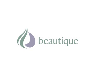
Logo for a line of women's all natural beauty products.
As seen on:
For Sale
Status:
Unused proposal
Viewed:
3850
Share:


Lets Discuss
I kind of see a negative b, a positive b and a droplet?
ReplyYes. The b shapes are subtle. Didn't want to force it too much. The droplet was intentional too. You might also see hair and a face. Thanks for looking, dude!
ReplyGotcha.. facing the type.
ReplyYep. :-)
ReplyI see the hair, the face, the droplet and the b. But I also see a garlic clove. I'm a foodie though, so that's probably why.
ReplyYou beautique!
ReplyMr. M : Ha, interesting perspective, Marshall. I can see what you mean.**itsgareth : No, you beautique! Haha, thanks man.
ReplySo many in one, tats a beautyk
ReplyThanks Sinder (Tats Me!). Robert (clashmore), I wanted the design to be organic and abstract. If all the shapes fit seamlessly together, to me, it loses that quality. Let me see what I can do though. Maybe another quick stab at it will do the trick. Thanks for the feedback.
ReplyPlease login/signup to make a comment, registration is easy