Description:
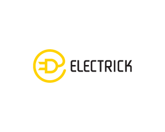
Could be used for a website with tricks on how to save electricity, an electrician named Rick, etc. The mark should read as a lowercase 'e' and there is an uppercase 'E' in the negative space to the left of the plug.
As seen on:
For Sale
Status:
Unused proposal
Viewed:
13339
Share:


Lets Discuss
Love the mark, maybe lowercase type?
ReplyNice clean logo, doc. Interestingly, I saw ED in the mark before I noticed the large lowercase e
Replynice, me like, lower case could work
ReplyActually I see an Uppercase E between the curve and plug. It could also be a clever logo for a politician named Rick as in Elect Rick %22he takes charge.%22 nice OC
ReplyThanks Alen. I'll try something out with lowercase. Thanks Roy. Perhaps ElectricDomain.com is available? The mark also resembles the @ symbol. Oh, the possibilities. Cheers! Thanks Alejandro. Keep up all the good work. And thanks Mike. Glad you noticed the hidden uppercase 'E'. Clever idea about the name. I'll have to use that on IncSpring. Thanks again all!
ReplyElect Eick he takes charge omgsh! thats tight
ReplyLOL @ %22he takes charge%22. Haha...clever.
Replysimple yet very well thought. The font needs to be smaller though
ReplyThanks Kamil.
ReplyRick the Electrician, brother to Joe the Plumber:P%0D*%0D*Ocularink, Joe the Plumber should be your next logo!
Reply%5E oh, we got one candidate for that already :) http://logopond.com/gallery/detail/39463
ReplyNice, very clean.
ReplyLOL!! Thanks, guys.
ReplyI see the e!
ReplyAhh this logo is rockin, great work.
ReplyThanks to both of you.
ReplyPlease login/signup to make a comment, registration is easy