Description:
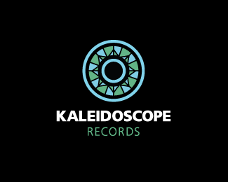
Record label and recording studio. Record + Kaleidoscope pattern
As seen on:
For Sale
Status:
Unused proposal
Viewed:
11829
Share:




Lets Discuss
Nice layout and type work but I think a little more color variation in the mark itself would grade this up.
Replyshhhhwinggg, a splash of colour kev and you'll be laughing
ReplyI like the colors very much. **I'm not sure what everyone else is looking for in this design. I think everyone is forgetting about having to print anything economically anymore. Not all clients are doing four-color process jobs or web only applications. Having a design create a mood and hold up in 2 or 3 colors is just as important. Nice job, Ocularink.
Replyim sur it didnt look like this before? :S
ReplyLove your logo Kevin! Excellent! In fact, I would have same comment about making mark more colourfull but not very constructive after 3 comments on it. So just a humble suggestion... Just thinking mark would be less geometric. Of course it has to be but each quarter (or 1/6 of the circle) of the mark could be less symetric, may be with more parts, looking more like a mosaic...
Reply@ Art : Thanks, man.**@ itsgareth : Yea, I reworked the idea a little bit. It needed to relate more to a record. :-P**@ leighton_hubbell : Thanks. And good points.**@ Thomas : Thanks. The pattern was inspired by a 48 facet kaleidoscope image.**Looks like some more color exploration might be the right idea. Thanks everyone for your feedback.
ReplyColor is subjective. This has a beautiful tone on tone feel. Not a bad idea for the brand if the color was an ever changing element. Could really relate to the name and the variety of music etc.
ReplyLove it.
ReplyThis is great. IMO you could add more colors or leave as is. The Artist personal preference will be fine here wither way. GREAT MARK!
Reply@ gthobbs : Indeed. Thanks and an interesting point, Glen.**@ Lawrence : Thanks.**@ ahab : I think you're right. Thanks.**@ Climax : One of my favorite, most underrated sans serif font out there. Myriad. :-D
Replyhmz....it looks like the old fashion window.%0D*dont know what is relates with recording ??%0D*
ReplyIt's a kaleidoscope pattern in the shape of a record. Does that make it more clear? Thanks for your input. :-)
ReplyOcularlnk I think the mark works nicely and the execution is on point. Adding more color is only going to reinforce the kaleidoscope, but I think it is pretty obvious already. I think there is a nice balance %22less is more!%22 I am a dj myself and as your target audience I think it works beautifully. I agree with you and using Myriad, I hear a lot of designers put it down but when confronted with it they are unable to recognize the font. Example: Apple uses Myriad and every designer I ask has no idea. Great work!
ReplyI love the color scheme and the type treatment.
ReplyI like the color as is as well. More color would just detract from the mark. **@calvinrosscarl: I agree about it not reading as a record at first. Perhaps its the proportion of the outer diamerter / hub diameter? It seems more like the proportions of a CD than a 12%22 LP. Maybe its a 45? Either way, I really like it.
ReplyBrilliant concept and execution. I too, would love to see more color, but it's beautiful as it is and helps with printing costs.
ReplyThanks everyone. Some really great points here to consider. Best regards.
Replylike art glass. Good job !
ReplyMissed this somehow, very nice buddy!
ReplyThanks Huyen, Nima and Alen! Think I'm going to put this up for sale soon as it never went in use by the client. Cheers, fellas!!
ReplyPlease login/signup to make a comment, registration is easy