Charter Staffing, LLC
by OcularInk • Uploaded: Oct. 03 '07

Float
(Floaters:
4 )
Description:
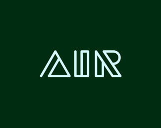
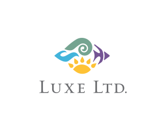
Created for a staffing agency. Their target audience is people in the aerospace field. The icon here is meant to convey team work (the idea of 4 separate shapes to create one icon), as well as, I wanted it to have a subtle hint of aerospace in the icon. If you notice, the 4 separate shapes are tail wings of a plane/jet. Thanks for looking. :-)
As seen on:
Charter Staffing
Status:
Client work
Viewed:
5671
Share:

Lets Discuss
Very clever dOc. You're coming up with some cracking logos lately. At first glance it did have a nautical feel, however. %3B)
ReplyI guess it doesnt scream aerospace to me because of the green. Perhaps trying silver,black and/or skyblue for the symbol?
ReplyGood point, dache. I actually had it the way you described. Ultimately, he wanted a color change for the icon though while keeping Charter Staffing, LLC blue. Also, the aerospace them was meant to be subtle. So, I think it still works. :-)
ReplyPlease login/signup to make a comment, registration is easy