TRG Eco Logo
by OcularInk • Uploaded: Apr. 08 '10 - Gallerized: Apr. '10

Float
(Floaters:
23 )
Description:
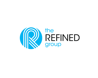
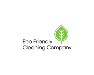
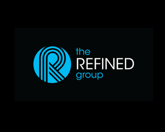
Eco logo to promote The Refined Group's eco friendly cleaning services. The leaf shape was pulled from the TRG 'R' symbol.
Status:
Client work
Viewed:
10792
Share:

Lets Discuss
nice :)%0D*
Replynice solid job kev.
ReplyThanks guys. :%5E)
ReplyClever Kevin!
ReplyDig the %22conservative%22 approach. That's very green of you.
ReplyThanks guys. Happy Friday!
ReplyVery nice logo Oc'!
ReplyThanks, thomas. Let's see some more stuff from you. Love your work!
Replyi like
ReplyThanks! Appreciate the gallery add. It's been awhile.
ReplyThe Iceman is back! Burrrrrrrrrrr
ReplyCongrats on the gallery! This is hot:)
Replygreat
Reply@itsgareth : And that's why I love you, man.*@brandsimplicity : Thanks Fabian. :%5ED*@aristo1970 : Much appreciated, Kerem.
ReplyIt's very strong in black but it makes more sense in white though with the whole eco friendly theme.
ReplyThanks, Ashley. The company's vans are black so the original logo actually started against a black background. But it works well against a white one too. Thanks for stopping by.
Replythis slipped past me - very solid logo work my man, love the equal line weights
Replynice and clean!
ReplyThanks, Raja. Means a lot coming from one of the masters. Also, thanks, Matt. You've got a nice showcase of work.
ReplyPlease login/signup to make a comment, registration is easy