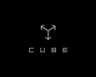
Description:
--
Status:
Unused proposal
Viewed:
5499
Tags:
cube
•
hidden
Share:




Lets Discuss
Love the concept here, think that you should widen the arrows a bit, to get more of a cube feeling in a 3D space... This way they almost create an triangle... Nice typography tho... Holla back! :)
ReplyInstead of default arrow heads, custom tweak them to match the appropriate parallels and this is hot.
ReplyType08 %26 Gthobbs::: Hmm... It is WIP, and I will try somthin... XYZ, you know? Thanks :)%0D*%0D* %3E %3E %3E
ReplyI completely agree with Glen (gthobbs). That will really pull this one to fruition.
Replythis is a very nice idea
Reply%0D*%3C UPDATE! %0D*%0D*Thanks Ocular %26 Shadow...%0D*%0D*:)%0D*%0D*%0D*
ReplyYep, much better my friend! Great logo!
ReplyThanks Alen, ( I have another idea with this logo... work, work :)
ReplyClever :)
ReplyPlease login/signup to make a comment, registration is easy