Bodegas Nodus
by MiriamRos • Uploaded: Sep. 29 '25

Float
(Floaters:
0 )
Description:
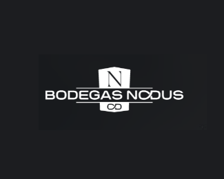
This logo belongs to Bodegas Nodus (Nodus Wineries). It is designed to convey a sense of heritage, quality, and classic elegance, fitting for a winery brand.
Logo Description
The logo features a central emblem and the full brand name in a structured layout.
Central Emblem
Shape: The core of the logo is a shield-like or crest shape, which immediately suggests tradition, authority, and quality. The shield is slightly elongated and rounded at the bottom.
Monogram: Inside the shield is the initial "N" in a refined, serif typeface. Below the "N," and within the same crest, are smaller, stylized initials, likely "C D" (or similar), possibly representing the founders or a specific line of the winery.
Color: The emblem uses a rich, deep red (a maroon or wine-red shade) against a white background. This color is strongly associated with wine, passion, warmth, and luxury.
Logotype (Text)
Brand Name: The full name "BODEGAS NODUS" is presented directly below the shield.
Typography: The text uses a bold, uppercase, sans-serif typeface, offering high readability and a contemporary contrast to the serif "N" in the emblem.
Layout Detail: A thin horizontal line runs above and below the text, framing it and visually connecting it to the central shield. This structure creates a balanced, stable look.
Color: The text also uses the same deep red/maroon color.
The combination of the traditional crest, the classic serif initial, and the modern, bold sans-serif lettering creates a balance between historical prestige and modern relevance. The wine-red color palette reinforces the brand's product and speaks to quality and passion.
As seen on:
Bodegas Nodus
Status:
Client work
Viewed:
228
Tags:
winery
•
red
Share:


Lets Discuss
Please login/signup to make a comment, registration is easy