logopond
by Mikeymike • Uploaded: Jun. 04 '15 - Gallerized: Jun. '15

Float
(Floaters:
14 )
Description:
damn this is addicting. can't get it out of my head.
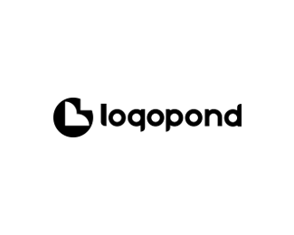
Here is a cleaner geometrical version.
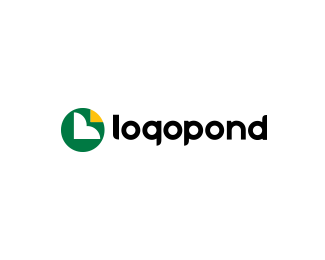
has the pad, L and the flower.
just for a look see.
Status:
Just for fun
Viewed:
5233
Tags:
pad
•
lilly
•
flower
•
L
Share:


Lets Discuss
This answers the question "how do you get the worlds best logo designers to design the logo for your website?"
ReplyAnother great solution!
Man, this is so killer. Love it Mike! I'd maybe make the type a tad smaller, while keeping the baseline the same. Currently, the type looks like it's above the center point of the mark. Either way, big fan.
Replylumavine and Sam, thanks for the nice comments, appreciate it.
Reply^ This type is quite similar to yours (currently in the Sandbox). However, it's your G that's bothering me. That bottom curve of the tail seems out of place and draws to much attention. It's not elegant. Mike's here, though, uses the same character for the G and P (and the D! Nice!), just reflected. There's a nice and simple poetry to that. However, it's certainly not enough to ruin the logo.
ReplyYeah, I mean technically it probably does look more like a Q if you were to view it by itself. But, in the context of this very familiar word it's not a probably.
Reply*not a problem. (looking forward to comment editing!)
Replyjust for fun, i added another version on here. made the lilly pad the P, L is still the main flower and the whole design has a nicer balance I think. Cheers.
ReplyThis just might be my fave of all.
ReplyThx, Glen!
ReplyThis is my favorite.
ReplyTHX, Trish. There are some nice logopond redesigns options out there.
ReplyShows how much the designers here like this site.
cheers.
Please login/signup to make a comment, registration is easy