logopond
by Mikeymike • Uploaded: Jun. 01 '15

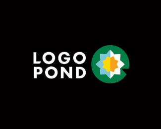

Float
(Floaters:
21 )
Description:
Ok, I know I should stay out of this, but what the hell.
What about very geometric and straight down from the top. And yeah Mike E. I got that pac man pad in there too.
Status:
Just for fun
Viewed:
2437
Share:


Lets Discuss
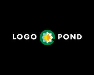
The colors aren't quite right for me, but I really like this approach. Did you intentionally line up the type with the notch in the lily pad? That's a great idea, but it looks like it's off by about one pixel.
ReplyNice. I did one kind of like this but didn't upload
ReplyWhy would you stay out of this Mike? This is just for logopond love and homage sake :) Nice attempt, colors are a bit over the top :)
ReplyThanks Sam. yeah saw the pixel thingy. changed it a tad.
ReplyJerron, love to see it.
Bojan, I guess you guys seemed to have it covered so I was hoping not to overstep my bounds. Some great suggestions.
David...Ha! steal away, looks better on your anyway.
I placed a very different versions I had already just never remembered to place them when I first loaded. Also tweak the colors a bit.
This was fun, just some talented peeps exploring possibilities. nice.
wanka wanka wanka.....
Replywhata? whata? whata? :)
ReplyAfter Luma's froggy eye/minimal pad mark, I'd say this is my next fave. However, I feel like the flower uses too many colors, or the strict vertical divison of color bothers me. Otherwise, solid design, Mikey.
ReplyThanks Jon, Appreciate that.And I do like Luma's direction.
ReplyJon, also forgot to mention I placed a couple other samples without the extra colors.
ReplyBIG MIKE!If you and Muamer could combine your 2 logos, I think it would be winner winner Frog legs dinner.
ReplyNo one gets it....
ReplyTry morphing your logo and Muamers.
ReplyI get it BIG Mike. Mainly because I like frog legs.
ReplySeriously you're thinking my center yellow flower in his solid colored design.
BIG Mike I placed another combo in my samples that I think is what you are talking about as far as another option. CORRECT?
ReplyYeah sort of. Maybe just a yellow dot.In center of a star shaped flower. Hard to explain.
ReplyPersonally feel these 2 are right there.
ReplyPlease login/signup to make a comment, registration is easy