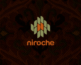
Niroche
by Mikeymike • Uploaded: Jan. 05 '11

Float
(Floaters:
28 )
Description:
WIP. concept for a company dealing with knitting material.
Status:
Unused proposal
Viewed:
2602
Share:


Lets Discuss
%5Egood point. Nice Mikey!
ReplyHummm, I was wondering on that. thanks, ben
ReplyRounded off the upper right corner of the %22N%22 and slight curve to the %22r%22. What ya think?
ReplyMikey, have you thought of doing the r with a slight angle %5C? or stepdown?*
ReplyMike, I did lower the right side of the %22r%22 a tad and gave a little curve the top, but are you saying take the right side down a little more? Maybe I'm just not following you.
ReplyI think it looks much better, just too hard to articulate what I mean and in the end might not be better anyhow. This looks fine as it is.
ReplyThanks, Mike. Value your opinion and thoughts.
Replynice stuff, Mikey. maybe change the N a bit? make both upper right and left corners similar perhaps. i belive that the rounded right angle is not the best choice, it looks a bit misplaced.
Replygood job mate .. really good job
ReplyI can c a better R formation, mikey...imo. Rest is working quite stunningly well...:)
ReplyThanks for all the input. some good outside perspectives.
ReplyUpdated the %22r%22 a little. gave it a bit of a slant and gave the %22N%22 less of a rounded corner on the right side.*The client rejected this direction, but I am still wanting it to look right. Thanks everyone for the suggestions. I'm liken it now. cheers.
ReplyMike - I think you're better off staying upright on the %22r%22 as opposed to slanting it like you've done - looks out of place. Dare I say it, I think you're going to have to break the continuity of the continuous script type and go with a more traditional style of r that breaks off from the rest of the type on the right side. Nice logo direction nonetheless.
ReplySteve, appreciate the comment. It may be a bit of over kill on the curve of the right side of the %22r%22, but I think it still fits okay. I think the continues line works for the knitting theme. The client has rejected it any way, but I am just trying to make it comfortable for me at this point. Thanks for the insight. Always learning, thanks to everyone here. cheers.
ReplyMan I'm stubborn. :) One final update. Little less curvature on the %22r%22. Now, I'm happy with it, even if the client isn't. :)
ReplyHave you tried using comic sans there?
ReplyYeah :) but that got shut down also. Who woulda thunk!*the most popular font of all..
ReplyPlease login/signup to make a comment, registration is easy