Float
(Floaters:
67 )
Description:
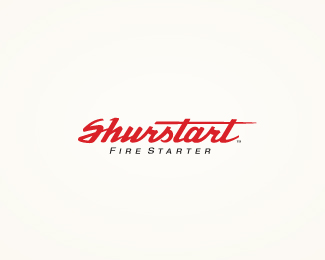
WIP. Client wanted to see versions with type only. What do you think? (type only)
Status:
Client work
Viewed:
7077
Share:


Lets Discuss
Thanks for the comment, Alen. I agree with the type only direction, I think it would be more memorable long term. I based this off a memory of a small canister, with similar type on it, that my dad use to buy, it contained small round pieces of flint that you would stick in an old cigarette lighter to cause a spark and ignite the flame. Can't remember the name and can't find it any where but always remembered it. Don't know why. Memories aren't they something. :) Thanks again for the comments Alen, always appreciate your point of view.
ReplyTHAT'S HOT! (see what I did there?) Mike, this logotype is absolutely fantastic. It really fits the tone of the client's business. I totally get a firestarting vibe from it. Job well done, man!
Replythanks, jon. client is still leaning for the icon version, but was willing to look this direction, so the creative continues. :) So I appreciate the comment.
ReplyWhile the icon is nice unto itself, I really don't think the mark needs one, because this type is just so damned sexy all by itself. I sure do hope the client goes with this version.
Replythanks, jon, i'm trying to get them there. But as you know their call counts. they are good to work for though, so that's always a plus.
ReplyJust got word from the client, they are going to use this design. They said they may want to bring in the fire graphic from the other design down the road, but only for background graphics. I'm glad they went this route. Thanks for all the comments everyone.
ReplyNice Mikey!
ReplyThanks, Mike
Replyexcellent again...
Replythanks, nido (again), yeah I'm glad the client is going just on the type route.
ReplyMuch stronger with type only IMO. Great.
Replythanks, joe. means a lot coming from you big hitters. seriously.
ReplyAwesome news, Mike! The client made a wise decision. Very happy for you!
ReplyDefinitely this one! As a mark for a fire starter, it would look good even on a car - reminds me of Ferrari a bit.%0D*Set the fire blazin', oh yeah! (:
Replythanx, myob.
Replylove this, love this, that is fantastic type. Yer pretty much a big hitter yourself Mikey, stuff doesn't come much better than your work. Well done.
Replykinds words, Paul. thank you.
ReplyYou rock, Mikey!
ReplyLooks great Mikey!
Replylots of kind sugar out there today. Thanks, milou and U2 Michael.
ReplyReally lovely type work.
Replyonce again, really nice work here, mikey :)
ReplyMikey. that's a fine piece of excellent type.
Replywhat a wordmark... i say WOW! impressive %3B)
ReplyMike, this is sooo good :)
Replyrichard, mh, cris, deiv and jovan, thanks for the nice comments. thanks for taking the time.
Replyi think the mark is great as well, could be used efficiently separately. when seen together, they kind of overpower each other.
ReplyStelian, that's what I threw at the client also. After they reflected on that a bit the agreed. we may bring it in later, just as a design element in some packaging down the road. Small company, so we are starting small. I hope it goes good for them. Nice client and good people.
ReplyI'm sure such a works don't need a mark next to it! It's strong enough!
ReplyYeah the mark (from prev. versions) is cool...but your type is very strong %26 can stand on its own. :)
Replyhi, hayes. thanks, mate means a lot.
Replyvery strong ... HOT
Replygreat !
ReplyGreat stuff!
Replyyep great!:)
Replysbj, allan, bilebo, contrast8 and Alen, thanks so much for the comments. really glad the client went this route.
ReplyI think is Beautiful!! :)
Replythanks, oronoz. means a lot.
ReplyLove that type mano. Bookmarked that one!
Replythanks, Andrew.
Replythanks for the kind comment there, Kanze.
ReplyPlease login/signup to make a comment, registration is easy