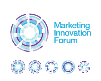
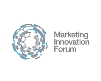
MIF
by Mikael • Uploaded: Apr. 22 '10

Float
(Floaters:
10 )
Description:
Marketing Innovation Forum Bulgaria 2010. Organised by the most forward-thinking newspaper in Bulgaria - Capital with Globul telecom and others.
Status:
Unused proposal
Viewed:
1837
Share:


Lets Discuss
I like the little circles that identify each letter but don't think they quite work with the typography.
ReplyAgree with hyper. Icons bigger so they touch and type smaller maybe.
ReplyYo, yo %3B)
ReplyAdder @ :) **hypermind jonnyd @ These should represent pie charts so they should not touch... for the composition - ill try the charts bigger - the type smaller. Thanks! :)
ReplyVery clever and nicely executed. I dig it as is.
ReplyThanks, much appreaciated from a man who has twelve pages of (quality) logos :)
ReplyNicely done...simple and well executed.
ReplyТCEDF CACECDсеCFт DFCA ACиCAеCBе%3B)
ReplyNeshto ne priema kirilicata tuk:D*Kazah che concept-a e yak!:)
ReplyPlease login/signup to make a comment, registration is easy