Description:
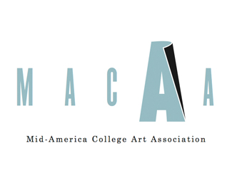
Final round of logo comps for the 2008 Biennial Conference hosted by Herron School of Art and Design. The central conference theme is Aggiornamento (uh-jawr-nuh-men-toh), which means "the act of bringing something up-to-date to meet current needs."
As seen on:
macaart.org
Status:
Nothing set
Viewed:
6504
Share:

Lets Discuss
Hard to decide, but I think THIS is the best of the designs. I love the colors.
ReplyThank you. This is still one of my preferred favorites. In the end, I feel that the client strayed from this option due to the fact that the conference name is a bit of a misnomer in that they cover more than the Midwest/Middle America.
ReplyThat's a shame, because the design is brilliant. And the colors look great together.
ReplyProof positive Michael, that the client often has his/her head up their backsides. Well executed work, and the best of the bunch.
ReplyPlease login/signup to make a comment, registration is easy