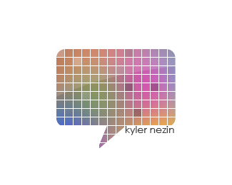
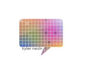
Kyler Nezin
by MesaDesigns • Uploaded: Mar. 15 '09

Float
(Floaters:
3 )
Description:
[WIP] Personal Logo, the negative space isn't enough to read KN. Well at least I don't think so.
Status:
Nothing set
Viewed:
1774
Share:


Lets Discuss
For what it's worth, i read KN while cruising your showcase %26 without seeing the title.
ReplyI read it right off as well.
ReplyGreat! I think it's a pretty successful mark then. Any advice?
ReplyI'd be interested in seeing what it would look like if the angle of the N's diagonal bar matched that of the backwards K. That would widen those two far right shapes and balance with the width of the K. Just a thought. It may not help. I think it's nice like it is too though.
ReplyYea, I read KN instantly.
ReplyPlease login/signup to make a comment, registration is easy