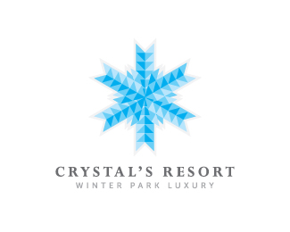
Description:
Crystal's Resort was an idea for a winter based luxury resort where people that love the cold climate could enjoy skiing, hiking, beautiful views, world class accommodations, and finest cuisine.
The resort was built with mostly glass to enjoy the views, thus the mark resembles both the building and snowflakes of course.
As seen on:
McGuire Design
Status:
Unused proposal
Viewed:
10135
Share:



Lets Discuss
Would love any good feedbacks. Thanks.
ReplyIt's a great idea using the triangles to give a glass or crystal appearance. I think it needs to be simplified somehow so that the effect is equally apparent with the snowflake, when viewed not so close.
ReplyThanks Jerron, I will see what I can do. Appreciate your help.
ReplyI like the overall feeling on this one%3B the light gray (?) stroke on the mark kind of bothers me a bit, also, i agree with jerron, might look better simplified a bit. However, i can see this working as is.**I'm glad you started to green flag your designs, there are lots of great logos i wanted to comment on.
ReplyHey, Robert! Very attractive, I like this.
Reply@Lecart - thanks and I will start opening up my logos for comments as I hope they will be good and some good ideas for any changes that will make my logos even better :)**@Ethereal - Thanks very much, really appreciate that.
ReplyPlease login/signup to make a comment, registration is easy