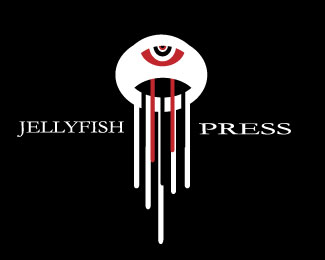
Description:
week 4
Jellyfish Press is a new press company in town. It was started by a group of designers fresh out of school.
Status:
Student work
Viewed:
924
Tags:
•
steven Henagers College
Share:



Lets Discuss
I'm really liking this! but id bring the font just a touch closer to the jellyfish. but i love how the lines look. i jellyfish are squirmy but you pulled this off very well!
ReplyTo me it looks like an alien drooling. The dark red does not work well with the black background and I am also trying to figure out why the jellyfish has an eye in it. Nice clean lines though.
Replyi like this illustration a lot. granted it doesn't scream jellyfish to me, the colors and the shape. it reminds me of mike from monsters inc. if was stoned and ate some bad tuna. i don't know why that appeals to me, but it does. cheers
ReplyTake the eye out. The jellyfish body should be a little flatter with a larger opening to better illustrate a jellyfish. Make the jellyfish tenticles long drips like ink. Use CMYK colors to relate to "press". Change the font to a san serif that compliments the style of the jellyfish. Do all that and you'll have something really decent.
ReplyPlease login/signup to make a comment, registration is easy