Description:
Week 2 Project
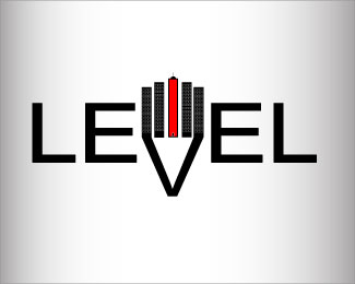
For my class project I had to create a logo for a construction company who specializes in building skyscrapers all around the country. The company is called, "Level". This is what I created. The first tower and the last tower has a shadow that makes up the "V" in Level. I thought that was really neat feature.
Status:
Student work
Viewed:
1444
Tags:
•
steven Henagers College
Share:


Lets Discuss
gradient usually distracts people away from logos but you did a great job of making it apart of your logo. the color of the gradient fits perfectly. you really did a great job with this! i do love how you added the gradient. nice work!
Replyi did just notice that you changed the L back i actually liked it backwards. i think it gave it that little extra
ReplyGreat job on the logo, I like how you put the buildings in with if, I just wish the buildings where level with everything else that is in it.
Reply
ReplyTook your advice Bryan.
Please login/signup to make a comment, registration is easy