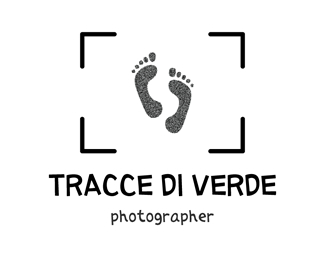
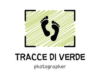
Tracce di Verde_1
by MDlogo85 • Uploaded: Mar. 05 '09

Float
(Floaters:
0 )
Description:
I have drawn this logo for the blog of a friend of mine. It's a blog of photos, on which my friend publishes his best releases.
In this version, I have represented a photographic machine in a very stylized way, so I can take back the concept of photo. Besides, the translation in English of "Tracce di Verde" it is "Traces of Green", and so I have taken back the concept of trace with the outlined line.
As seen on:
http://www.mdlogo.blogspot.com
Status:
Unused proposal
Viewed:
3046
Share:


Lets Discuss
A bit generic, innit? Also, I personally can't stand that font, the lower case 't' looks like a crucifix. Is there a reason why you picked that particular font? I guess it would be OK if you shortened the 't' a little. But more importantl: with a name like %22Traces of Green%22, shouldn't you try and incorporate that?
ReplyThanks for your feedback cybadelic. I have used the letter %22t%22 like a crucifix because the client that say me to draw this logo is a little bit alternative... But probably you said the true, it's better if I shortened the %22t%22...I'll try!!!
ReplyPlease login/signup to make a comment, registration is easy