Moonset_2
by MDlogo85 • Uploaded: Mar. 02 '09

Float
(Floaters:
0 )
Description:
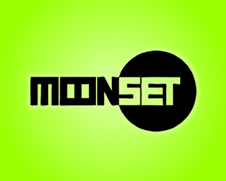
I have drawn this logo for the Moonset rock band.
In this version I have tried to represent the meaning of the word "moonset" and so I have drawn a simple moon behind "set." I have also exploited the contrast that there is, among the word "moon" that it is out of the moon and the word "set" that it is inside the moon, realizing so a contrast among the two parts of the word.
As seen on:
http://www.mdlogo.blogspot.com
Status:
Client work
Viewed:
1898
Share:


Lets Discuss
the photoshop effects do not help.*it's the design that needs work.**Contrast is good, as Paul Rand says %22without contrast you're dead%22**The idea of the moon being out of the moon and set inside is fine.*I would say that the font being all 90 degree angles and a circle lacks*a look of being designed. The circle being in black does not project as a moon. Try some other versions that are more stylized, even in a grunge design. Push it further.
ReplyPlease login/signup to make a comment, registration is easy