Logopond Wordmark
by LumaVine • Uploaded: Jun. 02 '15


Float
(Floaters:
15 )
Description:
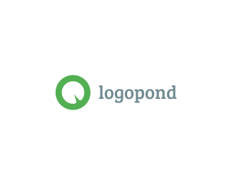
Another random idea. I think this color is much more ownable than the brown background. Thoughts?
Status:
Work in progress
Viewed:
3431
Tags:
green leaf logo brand
•
pad
•
lilly
•
lily
Share:


Lets Discuss
too late?
ReplyYea I think that having a neutral color is important for the showcase area, but an ownable color for the branding is key in my opinion. Don't be afraid of color! A nice green really could bring the identity together. By the way, whats up with the redesign? I couldn't see some of the stuff lately. I am sure you are hard at work on it, and I am excited to see where it leads!
ReplyPlease login/signup to make a comment, registration is easy