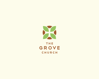
Description:
Logo Design for a church in Fayetteville, Arkansas. The brief called for a redesign of their old identity as there was new leadership who wanted to create momentum toward a new vision for the future. The target audience is a bit upscale in a community that values bike trails, farmers markets, and organic foods, but also is strongly tied to several large corporations whose headquarters are in town. The name The Grove Church was originally chosen to suggest a community who share the same source of water and support each other through deep, connected root systems. Their style is relational, casual, passionate, and Bible-based.
This concept combines ideas of community, eternity, and growth into an iconic symbol. Notice the subtle cross hidden in the negative space.
As seen on:
Behance
Status:
Client work
Viewed:
12825
Share:

Lets Discuss
Nice job. I like this layout best.
ReplyI like the mark very much!
ReplyClean, smart and effective. Great one, Luma, Bravo.
ReplyOh wow! Thanks so much everyone. Very unexpected to see this on the front page! I am glad you love it as much as they do! Still working on the details, but this is the direction is the one they chose. Exciting!
ReplyHi Luma ... that's definetely not a surprise ... love it !
ReplyThanks so much Bernd! You're the front page guru!
ReplyCongrats luma. Nice work!
ReplyThanks a million! It's fantastic to hear your comments!
ReplySimple, clean, nice negative space inclusion. Great stuff, Luma.
Replyvery simple and nice! fantastic work!
ReplyThanks, Thanks, Thanks! It really means a lot to me!
ReplyI like this layout, is compact, simple and clean!
ReplyThanks helsic!
Replythis is lovely! :)
Replynice simple mark with a subtle font to pair it, classy combo!
ReplyExcellent execution. I love it!
ReplyYou all are too kind! It was a great project, I sure enjoyed working with them!
ReplyI think you arrived at a very pleasant, effective, and thoughtful design solution with a clever subtlety that adds another dimension to the mark without taking it too far. Very nice work. Your client should be proud.
ReplyThanks atomicvibe! Great to see you getting involved here! Great, positive comments!
ReplyYeah, I'm really hyperfocused on my work these days. I've always loved doing logos, but I've realized that this is one area of graphic design I really want to push hard. My time spent here on LP has been tremendously influential to that end.
ReplySmall update! Thanks for all the views and floats!
ReplySimple and clear, nice logo.
ReplyThanks so much Antonio!
ReplyVery nice mark!
ReplyThank you balic! We went through a good number of concepts and revisions, and the end result was something that everyone loved. Great to see it all pay off!
ReplyLove this logo,Congrats luma.
ReplyThanks John! Thanks for expressing yourself here!
ReplyGreat work here!
ReplyThanks so much Savvyid! I appreciate your response!
ReplyPlease login/signup to make a comment, registration is easy