Description:
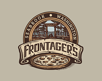
Logo for a gourmet pizza bistro located in Seabrook, Washington. Client wanted to include their unique local shoreline scenery into the logo. Main typeface here is custom.
Status:
Work in progress
Viewed:
13664
Tags:
•
ingredients
•
vintage
•
woodcut
Share:

Lets Discuss
Great work and great details here.
ReplyYummy
Replysome nice detailed work here. nicely done.
ReplyThank you guys! These are huge compliments coming from all three of you!
Replyso much lovely detail!
ReplyJesus, man, this is insane! The detail is unreal, and THAT'S what I'm talking about regarding type. You made it your own AND it totally fits within the context of the art. Bravo.
Replyawesome details Jess
ReplyThank you guys so much! I'm really feeling this 'style' as somewhat of a natural progression for me, so I think as often as possible I'm going to keep developing it.
Reply@Jon: It's going to be a slow process, but I'm enjoying working on my own type more, now that I am looking at it from a different perspective. I still probably need to pick up a few resources, though. And just like every other avenue of design when I start, I'm finding it takes foreeeever. But I'll get there. :p Thanks!
tasty looking
ReplyWish I draw like Jess.
ReplyJust another big wow.
Very tasty details
Reply@ wizemark and Facebrand - Thanks! Tasty was the goal.:)
Reply@xDick - I'm sure you could my friend, you do awesome work.
It's unexpected to hear this from you. Thanks, I appreciate your kind words.
ReplyAnd by the way, hope to see some other great illustrative logos from you, Jess. Keep up great work.
Such great skills at such a young age, you'll go a long way my friend. Keep up the fantastic work. Float and saved!
ReplyThanks for the compliments and float #50, Norman! I hope I'm able to go a long way, but I would love to chat with you some time about where to start! Haha.
ReplyAwesome. I love the amount of details.
ReplyThanks Zoran!
ReplyReally nice use of the woodcut effect here, looks awesome!
ReplyAll your work is amazing!
ReplyThanks quackcom, and Irfan!
ReplyAll your stuff is so classic, you have inspired me. Thank you :)
ReplyThanks, Kurk! I truly appreciate it.
ReplyAll of your identities are very, very good, man! I'm an old school GD and I always loved old treatment in the symbols and images that backed up logos and you my friend, are it! Keep evolving! I'm looking forward to see anything from you in the following 5 years!
ReplyPlease login/signup to make a comment, registration is easy