Secret Path Cidery
by LuBeraDesign • Uploaded: Mar. 01 '15 - Gallerized: Mar. '15

Float
(Floaters:
134 )
Description:
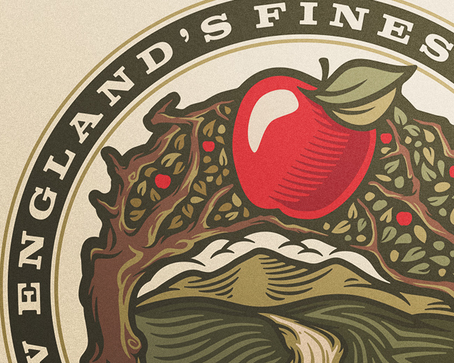
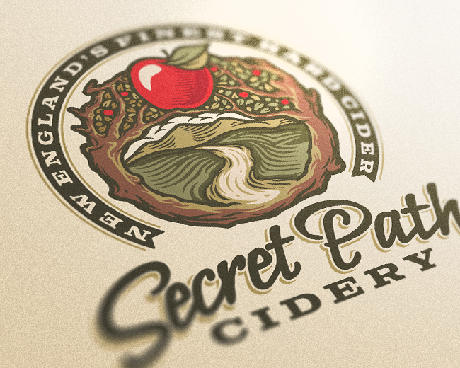
Logo done for a brewery focusing on the crafting of colonial New England hard cider. Also currently doing a series of label illustrations for five varieties of cider.
Status:
Client work
Viewed:
16,923
Tags:
•
brew
•
brewing
•
cidery
Share:

Lets Discuss
Wonderful. Hats off to you, Jess.
ReplyThanks, Dick! I'm excited to see where the rest of this brand takes me.
ReplyNot entirely certain on the text but the rest of the illustration is absolutely brilliant, and that's why I'm putting it in the gallery, so more people see it. Well done.
ReplyFirst off, thank you for the compliment of the gallery add! Secondly, I was really feeling this text, you killjoy. :P Seeing as it is sometimes a weak point of mine, what would you personally suggest that could improve upon the mark/text paring? Critiques are welcome.
ReplyJess this is awesome :)
ReplyThanks Sam!
ReplyWonderful!!!! Nice!!! Cool!!
ReplyComic Sans? haha, I'm terrible when it comes to font selection too. I don't think it necessarily a bad choice, think the direction of the font is correct, may even add very close, but I just feel uncertain about it when looking at it, maybe needs to be something more solid to match the strength of the image?
ReplyTry experimenting with a wine bottle? See how the branding will work on the product. With Both type and Image and without. The Image here is fantastic and I can see it centered on a Bottle, but how would you present it without the square background. How will the Type hold up on it's own? I'm still learning too...
ReplyThanks, olkiller!
ReplyNido/Mike: Well, as this is his maker's logo, it will likely only appear stamped into the glass on the back, and on the neck label of the cider. I added another thumbnail with revised text that will work as a neck label.
Beautiful work mate!
ReplyThanks! That means a lot!
ReplyThat's just amazing! I love all the details.
ReplyThanks, Nikola! It was a lot to break down, but in the end I'm happy with the overall flow. :)
ReplyThank you! And your logo definitely leans on my personal aesthetics, definitely a keeper.
ReplyJeeeeez, Jess. This is ridiculously awesome. To Nido's point, I don't necessarily dislike the type, but it looks like a font to me, and any time I see a script, I want to believe it's custom. When I see repeating letters that are the same (the E's) it kills the illusion to me a little.
ReplyThe illustration is so wonderful and has such a strong, artisan, handcrafted feel to it, why not approach that script the same way? You could use the script font you currently have as a sort of reference, but draw your own, and customize it to really feel like it belongs here. Like the endstrokes of both the S and the H could have a similar curl, adding a stronger sense of symmetry and balance.
Anyway, just some thoughts. I freakin' love this.
@atomicvibe: Are you seeking a padawan? :D Just checking out your other comments on my stuff here, I absolutely love the critiques, they allow me to see through other eyes, and it definitely helps me to improve! I actually wish I could get more discussion like this going. Rather than comment on each individually, I'm going to go ahead and PM you, but let it be know to others that I'm not ignoring the feedback/critiques and would love more from anyone who has thoughts on my stuff.
ReplyAwesome illustration skills!
ReplyThank you, Antonio!
ReplyBeautiful!!
ReplyThanks, Rox!
ReplyCongrats on the feature!
ReplyCongratulations LuBera Design!
ReplyCongratulations, Jess.
ReplyCongratulations Jess :)
ReplyThanks, everyone! And thanks to Logopond and all of the members who have floated my stuff. I'm so psyched to see my logo up there!
ReplyJust want to say THANKS to everyone who floated this! I can't believe it hit 100!
ReplyYour designs are really awesome.
ReplyThanks Alex! As are yours my friend.
ReplyOH woww! Awesome work!!!! Love the style!
ReplyPlease login/signup to make a comment, registration is easy