Description:
Great concept for Wine Search Co.
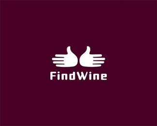
Seen all the negative space Wine glass bottle but I personally have not seen this? mark is 2 hands OUT as if Where? The hands together form a wine glass in negative space. I kinda think it's cool because at first site it almost looks like to birds (doves).
Status:
Just for fun
Viewed:
4744
Share:



Lets Discuss
I like the mark Mike, but the type doesn't seem to fit IMO.
Replythanks, I agree will change :)
ReplyHadouken! Just kidding. **I'm struggling with the concept a bit. I just can't see hands like that so say, %22Where?%22 Maybe my special helmet is fastened too tight today. I do like the simplicity of the mark, but I agree with JP about the type. If you do decide to keep it, I would try to do something with that bowl of the D. It's....deflating...Good luck!
Reply%5E um OK that's cool with me. Not every will get things.
ReplyOoh nice, Mike.
Reply%5EThanks PoPs %3B)
ReplyDrunken Dove Style! Nice idea Mikster!
ReplyHa, yup, I was determined to make it look more like drunken doves but had to keep hands also.
ReplyI could also make this into a drunkin cat if I add two eyes above LOL!!!
ReplyType looks nice now.
ReplyNice job Mike
ReplyI find the name hard to say. Keeping trying to say FineWine. Anyone else, or am I just a little retarded?
Reply2 doves go into the wine cellar, no doves come out...bar man...takes the rest.**Don't mind me mate, just watched Jaws...
Replygood one mike.
ReplyYep, great concept mr.Mike.
Reply%5E%5E
ReplyLovely concept Mike, but I sort of agree with Thrasher- only in that the hand position is a wee bit awkward to me. I just can't imagine hands coming together like that. (I even tried it with my own delicate palms to make sure I'm not insane.) But that's just all imo, of course.**Regardless of my opinions, you still cranked out another good one. :)
ReplyHa, thanks but I did it myself, yes awkward but it can be done, go ahead knock yourself out trying :) Thanks Chad.
Replymy hands can do it. :P
ReplyIf you close the hands into a two thumbs up visual, it could even make a cool wine ratings site logo.
ReplyHell yeah...Ebert style: thumbs up or thumbs down rating
ReplyHEY! nice idea Fabian.. :)
ReplyHahh good idea! I was searching, I found it then...
ReplyClever negatif space!
ReplyCool stuff, Mike.
Replyfantastic mark!
Replymasterpiece!
ReplyThanks guys. Just for fun no real challenge here.
Replysimple great !
ReplyThanks magic, wish it was for a real client though. these are easy to do compared.
ReplyConcept done to DEATH!!!!
Replywish I could vote my own logo down.
ReplyI found Wine! Lots of it.
ReplyPlease login/signup to make a comment, registration is easy