Description:
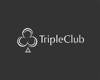
Rotating 3's to create the Club for Triple.WIP...Copyright Mike Erickson and Logo Motive Designs. © 2009
Status:
Unused proposal
Viewed:
3321
Share:




Lets Discuss
Client didn't like the others? I think this is a great solve though. If you have time, maybe add an accent mark to the stem as well to match the 3's. Looking bueno.
ReplyNo he does, just giving options. He likes the continuing effect of the 3's though. I like the simpler version. Thanks for the suggestion.
Replyclever and love the font choice
ReplyLike it.
Replydamnnn... I just created a very very similar thing for a client!... like the old saying goes %222 good minds go together!%22 (at least thats how my uncle says it)**nice mate...**:(**%3B)**:(
ReplyThanks guys. Nav, would not be the first time :) %3B( %3B)
ReplyThis feels the most complete. %3B-) :-)
ReplyBrilliant name, very nice mark
ReplyI definitely like this one the best out of the bunch Mike.
ReplyCheers guys. Clients (3 of them by the way) all like this one so that is a positive not to go on....
Reply%5ENote to go on..
ReplyBingo...the clubs have it..kudos:)
ReplyMy 2 cents... The upper part of the club (mark) looks like it's shaking (vibrating) while the lower part (stem) done this way is not. Thoughts on this Mike?
ReplyNice change to the stem to make it feel a bit more cohesive.
ReplyThanks guys. Alen, I've tried about everything and this stem was the best solution IMO.
ReplyFair enough... Idea though, what about just one curved line underneath it (detached) ?
ReplyAbsolutely love it! IMHO
ReplyClever!
ReplyAlen, I might try that. Thanks.*Thanks Muse and Stephen James.*My 3rd concept was to be 3 upside down cherries forming a club to relate to the slot machine side but client likes this one %3B)
ReplyPlease login/signup to make a comment, registration is easy