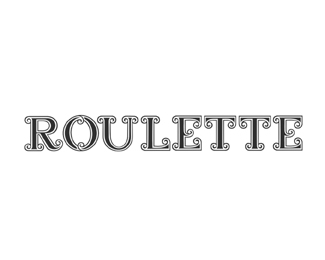
Description:
Roulette is the name of one of my typefaces I have been developing. This Typeface is design for large display purpose and intended for just that, as it is very detailed.A to Z done and half numbers..
Status:
Nothing set
Viewed:
3972
Share:
Lets Discuss
Impressive!
ReplyVery well! May be 'U' is too narrow.
ReplyThanks logotivity,carlove and nima. @carlove,right might widen that a little.
ReplyVery nice. Never had the patience (or skill) to design a font. Kudos to you.
ReplyThanks Glen, me neither that's why it's only a typeface right now %3B) fun to design, but not the tedious, monotonous programming part.
ReplySweet display font. Way to go bro.
ReplyThanks Julian, as your well aware it's going to take some MAJOR patience and more tweaking to complete %3B) I have a solid version of the outlines near complete also.
ReplyDue to the fact that it's not only a solid outline but like designing two typeface in one because of the double outline. Lots of control points and curves to deal with.Not sure it's worth it to be honest :)
ReplyI'd love to see the solid version. Both of them would probably sell pretty well on __Myfonts__ or __Letterhead__. But then the effort is enormous of course. *By the way I love looking at your avatar. :)
ReplyThanks Julian, your Ajeva work really inspired me to step it up and present more and quit slackin :) I like looking at my train too , maybe get a tattoo %3B)
ReplySure it%60s marvelous. I feel the taste of delicate Wild Wild West
ReplyThanks Serhos, Glad to hear that. That's why I named it Roulette %3B)
ReplyLogomotive, first of all what is your real name. (I dont like calling people by their screen names.) This is just beautiful, as a designer I think your work is by far some of the best inspiration for me. I hope to be as well developed when I come out of school as you are. (cant wait to attend school, havent started yet. Self learner as of now.) I just have to give you props, as I see it you are a very talented individual not only in the design aspect of things but in the concept stage of things aswell.**-Jordan
ReplyAbsolutely love the R and the O. Releasing on Letterhead fonts? :)
ReplyMike is his name, logo design is his game.
ReplyThanks Jordan, %5EOC has the answer. :)*Thanks Saawan, well eventually, hopefully.*
ReplyPlease login/signup to make a comment, registration is easy