Float
(Floaters:
20 )
Description:
WIP.. another option,custom type.
Status:
Nothing set
Viewed:
9720
Share:

Lets Discuss
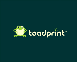
I remember when the front page was full of octopuses and seahorses...*Now it's toads!
ReplyHe's cute. Nice colours and font choice BTW :)
Replynice typohgraphy. the toad is indeed cute
ReplyIn the symbol the 'toad' is represented, but what about the 'print' aspect?
Replymaybe that's supposed to be the toads footPRINT above the i
ReplyIf that is the case then the mark to the left may not be necessary as it is repetition.
ReplyI do like the idea of removing the toad character, even if he is cute, just for the sake of simplicity.
ReplyDache, whilst it is 'nice' and even perceived as %22clever%22 for a logo to represent everything about what a business does it is not actually it's purpose. A logo is a handy placeholder that builds recognition on multiple viewings, it represents the business or service in the mind of the viewer.. it is not a list of services or attributes. But I am sure that you understand that. **I would suggest either keeping the toad or the dots above the 'i' but not both.
ReplyGeeze why all the fuss? Frog stays, dots stay for me.I think it can work together or apart and that was my intention (mascot) I do appreciate your comments though.
ReplyMemorable solution. I like the dots over the 'i'. The dots tie the mark and type together. To me, that's a bonus. And why does the %22print%22 aspect need to be included into the logo? Is that some sort of rule I'm not aware of?
Replyclashmore, with THAT cartoony character it's MANDATORY to include the print somehow...otherwise, it looks like a toy shop or something like that.
ReplyIT says %22toadprint%22 unless someone cannot read I don't see a need to show any print aspect in the mark or mascot in this case, I can think of MANY logos that do not have things spelled out in the mark, in fact by the very same people making these comments. It's all good though :-)
ReplyThe way his hands are positioned with the light color on his chest, it looks like he's holding a piece of paper. There. There's your print angle.
ReplyI think its really funny that everyone is talking about what the logo should be when we've all seen the logo and all know what it is.*Great job on the logo.*P.S. It looks to me like the frog is holding a piece of paper anyways (I know thats his tummy) Its a logo, we're not saving lives, I like it.
Reply@ graeme: huh? which one is the logo?
ReplyI believe the thing in the box at the top of the page is the logo. Are you not able to see it? It's the Toadprint logo I was referring to.
ReplyI thought it was just another option rather than the actual logo of the company....
ReplyWell this is still a logo.*I don't know about the other ones, but I was just saying that I liked this one, so I posted the comment here.**Sorry if that was confusing.
ReplyPersonally I really like the frog but I agree that this logo might appear better without it.
ReplyLOL, I guess everyone wins. Client went with one of my other designs. :)
ReplyPlease login/signup to make a comment, registration is easy