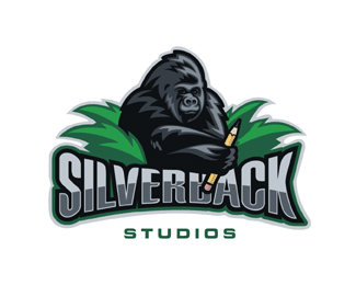
Float
(Floaters:
37 )
Description:
Had a hard time getting a gorilla to pose for me.
Status:
Nothing set
Viewed:
12498
Share:
Lets Discuss
Haha, Good one Mike.
Replyjajajajaja you obtain a good pose and a big pencil!!! Great illustration, love it!!
Replyjejejejej! great!
ReplyVery nice illustrative mark. Wanting to see a slightly brighter highlight on type and G-rilla. But maybe not.
Replythanks Relevant,yeah sometimes I exaggerate the size of my tool.
ReplyAwesome!!
Reply%22yeah sometimes I exaggerate the size of my tool.%22**LOL. man, it's just too easy, lol.
Replypersonally i dont see whats so great about this logo its like 7 diferant colours n you would never see the detail at business card size..
ReplyHmmm, 7 colors....I only see 2. What planet are you from jayell?**And that goes for you too Mike, having a tool like that %3B%5E) Nice one pal.
ReplyI don't understand why too much people think this is good. I don't like it. Can anyone explane to me what is the reason.
ReplyIt's all about the size of the tool...the bigger, the better!**Nice work!
ReplyIt's beautifully drawn in a great style. What's not to like??!
Replyto artboy %0D*I dont like it because this is not logo. Its just a preaty picture. In corporate identity product it will not work. Try to imagine ad poster with this logo. (. And the syle is like oldfashion clipart
ReplyLooks like we're getting back to the old 'it's a logo, it's not a logo argument'. I think it works well. Not all corporate identity has to be a monogram or a word. The style is graphic %26 simple, %26 the image is well integrated with the type.
ReplyThere are no rules when it comes to logo design - it just boils down to personal taste at the end of the day.
ReplyTime to step out of the box yurko and jayell. Points to consider:**Executed nearly flawlessly.*It has style.*Great colors. A solid 2/3 color design : Let's remember guys, there are different values of the same color. A great tip on how to fool your clients.*It has a concept.*The concept is clever.*Custom type (and very well done).*And this works fine at smaller sizes. I imagine it would work even better on a poster.**Truth be told, if anyone can master this style as well as Mike has, I'd like to see. This stuff is not easy. It takes a master.**Okay, Mike, hopefully your head's as big as your tool now. **Cheers!!*
ReplyThanks a bunch People, really. Hey I don't expect everyone to like my illustrative designs, perhaps there not for you but let me tell ya the General public LOVES them. I myself prefer simplicity,clever logos because of what I know and would rather do those for people. But there is a HUGE market for these what I myself call Logos. I'll admit I will probably never do a silverback gorilla again (the highlights and fur in simplistic form killed me) probably the most challenging object to date, I would rather have done a realistic one, it would have been easier. *OC and others thanks so much for your moral support bro's. And no my heads still not as big as my tool LOL!
Replyto OcularInk **thank you. i'll try to think about it. may be one day i'll understand ))**to Logomotive **you have a lot of great logo but this one is not my style
ReplyThat's the beauty of design yurko... everybody sees and likes different things. How boring it would be if otherwise.
ReplyIt's all subjective. :-) No offense to yurko or jayell by my previous comment.
ReplyIt's a very good illustrative style logo. Kind of reminds of a logo on a team jersey or something though - not sure why.
ReplyGood technical execution Logomotive
Reply%22 gthobbs said:**That's the beauty of design yurko... everybody sees and likes different things. How boring it would be if otherwise.%22**i second that. if everyone liked everything, life would be like one of those 50's tv shows, but taken to the next level.
Replynone taken i just prefer corporate simple logos, and i still see four colours not including the shades lol jst not my cup of tea
ReplyLike this! Style, execution, skill... a walk in the park for Mike. He's infuriatingly good and this kinda thing. Mike, in my own take on the famous line by Jack Nicholson in 'As good as it gets' ..... you make me want to be a better designer!
Replyoh Mikes back with a vengeance!.. silverback with a vengeance!
Reply:) very nicely illustrated
ReplyThanks Funny stuff guys, see it's OK to have different opinions. that's what makes design so cool. Nice to hear different opinions.
ReplyDifferent Strokes for different folks.
ReplyI love that gorilla(z) Mike.
ReplyThanks He was pretty hard to design.
ReplyPlease login/signup to make a comment, registration is easy