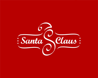
Description:
A current project, WIP... make any sense??Custom type.
As seen on:
www.logomotive.net
Status:
Nothing set
Viewed:
14434
Share:


Lets Discuss
wow Great job bro!!!...love it :D
Reply@oronoz, thanks bud glad someone else approves. Love your work BTW.
ReplyTnx bro!! That means a lot coming from you!!!
ReplyAwesome. I immediately saw the flipped %22F%22 and then after looking at the mark closer, saw the %22S.%22 I think I need to start the Logomotive Fan club!
ReplyYes, definitely works. I like it. The font seems a little weird though... but it might just be the anti-aliasing.
ReplyI hate you!! :-P
ReplySame as alto. Classic Logomotive.
ReplyThanks guys.*@ OC :-P but I like you.*@ alto, LOL! and firebrand, thanks for your moral support. **
ReplyAwesome work... once again I strongly says that, I love your works...
Replyvery nice indeed
Reply@rambal, thanks bud really appreciate that.*@drewboy, thanks.*Still working on other concepts will keep you posted.
ReplyDid I mention how much the type kicks a**!?!
ReplyNo,.. but OC that means more to me than you know. I put a little sweat into it. :-)
ReplyJust fantastic Mike... Fantastic! This tech-style font is a success.
ReplyThanks Thomas, but it's not a font,........yet. Thinking about it though I could use it in a lot of places.
Replyjust wow dude! :D one of the best in this site! i haven't noted the s! good one!.
ReplyThanks guys! cheers*
Replywicked!
ReplyThanks Flant :-) I guess wicked is good.
ReplyI was wondering when this was gonna make it into the gallery... :)
Replyhttp://www.fox.bg/
Replygenius.
Reply* raja presses 'amazing' button
ReplyYeah, this makes total sense, Mike. It's very cool.**Just curious... have you tried adding the white %22twist%22 space/hi-lite tot eh center of the %22S%22. As I look at it the twisting effect from both ends of the %22S%22 seems to kind of go nowhere. I think it would be an interesting try.**Of course this is still **great** and the font is a source of envy for all of us.
ReplyYou are an unstoppable Logomotive!! Toot toot!
ReplyThanks guys, this was final.*@ Ahab, I know what you mean, I did a version like that but...well it was just too much visually and kind of took away the s aspect. :-)
ReplyYeah, I can see that, Mike. Just a curious suggestion.
Replybrilliant! I kept on looking at the flipped 'F' then saw the S. really nice.
Replynice
Replyvery nice, i love the shape.
Replyi keep seeing this one in the gallery and loving it every time. very nice work.
ReplyVery nice work Logomotive - very clever.*
ReplyThanks guys, very much appreciated.
Replytoo cool.
ReplyNice typo %26 sign
ReplyThanks Glen and Vladimir.
ReplyOh my god...that font's fantastic.Very cool mark bro!
ReplyBelated Thanks Fabian %3D)
ReplyQuite nice.
ReplyThanks JF, just got featured on www.logomotive.net (hopefully we have a sense of humor here). :)
ReplyVery Nice, *I like to use it for my website :FCTIO.com *considering the fact that it consists of two F , which can convey the concept of translation.
ReplyThanks Fardamm. This is in use by client and registered.
ReplyPlease login/signup to make a comment, registration is easy