Description:
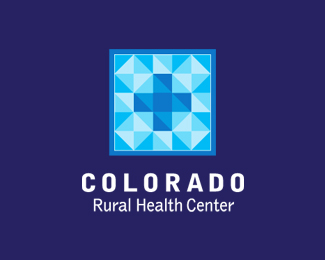
WIP. Using a contemporary facet design to represent a blanket motif. The blanket represents security, warmth, community and rural. Medical symbol in the center.
Status:
Nothing set
Viewed:
5059
Share:



Lets Discuss
i love the icon, i bet it looks very nice in black and white too*
ReplyThanks ndmgfx. We'll see what the client thinks later today!
ReplyThanks Relevant. Sorry to take another CO biz from you :-) But not really.
ReplyI love the look and the patchwork quilt concept is spot on. I wonder though if it needs to be all blues. Would this work if you used more colors for the patches and warmer tones to create the ? just a thought. As always Hobbs great fing work. Dam you man.
ReplyI love the look and the patchwork quilt concept is spot on. I wonder though if it needs to be all blues. Would this work if you used more colors for the patches and warmer tones to create the cross? just a thought. As always Hobbs great fing work. Dam you man.
ReplyGood comment werthless. This is the first blush color. If the client likes the design I will do a full study.
ReplyWhat's it look like without that top overlay? that part my eye keeps focusing on. in other words this overlay %5C. or stop at octagon and not over. Perhaps I'm missing something, if so excuse my ignorance.
ReplyI see what you're seeing logomotive. Not really any overlay here but it's simply where I'm placing color values (in this case 4 tints). It will take some exploration to get around some of the eye traps like that slash you're seeing. That was kinda bugging me too so good comment.
ReplyAh yes gt, gotcha. Smart.
Reply@ smartinup: they're in there but it was so subtle that I didn't want to force it
ReplyThanks fire/smart!
Replyand thanks David!
ReplyIt stands out well on the front page.
ReplyWas I the first to see a snowflake here? I saw it before I read the attached note about the quilt concept. Colorado, blue skies, snow… And I've been enjoying all the monochromatic art here lately. Nice execution,
ReplyAnd when it snows... you need a blanket to stay warm...and if you don't stay warm you have to get medical attention for exposure...it all comes full circle. I don't miss a thing. @Tonfue: If they choose this one I'll do a full color study and see what happens.**Thanks Fogra/Tonfue/Unit B!
Replyit makes me dizzy when I try to find the letters inside there.. lol.. nice job hobbs
ReplyLove the colour. Very beautiful. Well done :)
Replyi think too difficult...**
Replyyurko, if referring to the letters I totally agree. Which is why I didn't make that claim from the offset.**Thanks jen/logotivity!
Replygthobbs, I mean not only letters... The concept and idea are good but when I'm looking at this logo I feel its very big and very complex... Maybe it because I like simple logos.*And do you really need frame around the mark? Maybe it could be better without this frame...
ReplyWithout the frame it looses the patchwork blanket feel.
ReplyVery sweet.
ReplyThanks diez.
ReplyPlease login/signup to make a comment, registration is easy