Renovare
by LogoBoom • Uploaded: May. 21 '08 - Gallerized: May. '08

Float
(Floaters:
24 )
Description:
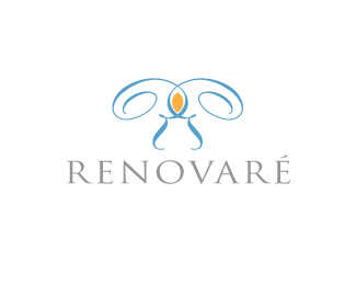
Company started by a group of authors promoting christian values. Jesus fish x 3 to form trinity knot and 3 chalices. All in a stained glass.
Status:
Nothing set
Viewed:
4427
Share:


Lets Discuss
:-) This looks much better. Nice colors too. One question, do you think the 'RENOVARE' text is too light in comparison to the mark? Or is the mark too heavy in comparison to the type? Either way, nice improvement Glen. Your work inspires me.
ReplyThanks man. I'll be playing with the mark/type balance. Doing a full logo suite for parent company and program icons for these guys. So this will get refined if this is where we land. Thanks as always for looking and taking the time to comment.
Replythis is very nice.. great peaceful feel about it.
ReplyThanks nido.
Reply@Glen: Very clever. I like it a lot, but agree with Oc about the text. Have you tried incorporating pink/rose for the centre piece of 'stained glass'. I think adding a brighter colour would help to visually associate the stained glass idea.
Reply@ Oc / Koodoz: playing with colors and weight balance. Thanks so much for the feedback. Sitting in a vacuum at 1:00 in the morning I need checks and balances :-)
ReplyAwesome!
ReplyNice work GT... like your comment about not showing client until sign off from ocularink. Classic.
Replythis logo have spirit and give strong feel ... very nice work. Did you thing about tripple eye of the fish in the middle of symbol as one dot?
ReplyGreat concept, gthobbs! Perhaps, for a better balance, the circle's line could have the same width as the fish's line. What is your opinion?
ReplyI think it would look just as cool with the three jesus fish with out the outer circle! Either way nice job!
Reply@ janz: I've got a version like that with the eye. It draws the eye almost too much (pun intended). But it will be an option for the client review. Good catch. Great minds (and people like us) think alike.**@logotivity: that also is an option I'm showing the client. But the circle provides the frame to sell the stained glass idea. They may actually have this created as a window down the road.**Thanks for all the comments. I'll post a new version along with sub brands.
Replyawesome!
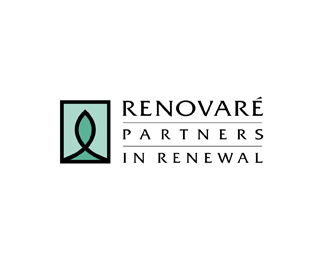
ReplyThe Renovare logo suite is outstanding.
ReplyOk, this is the final client approved version. Thanks for all of the comments.
ReplyDon't it feel good. :-)
ReplyAmen.
ReplyPlease login/signup to make a comment, registration is easy