Description:
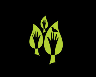
Logo for community garden initiative - bringing people together to learn basic gardening skills.
Status:
Nothing set
Viewed:
5513
Share:


Lets Discuss
I love the green.**%3Ca style%3D%22overflow: hidden%3B text-decoration: none%3B width: 50px%3B background-color: %23ffffff%3B display: block%3B float: left%3B text-indent: 1000px%3B white-space: nowrap%3B%22 href%3D%22http://www.vibeplate.com%22%3EVibePlate.com Vibration Traning, Vibration Platform, Vibration Therapy, Power Plate%3C/a%3E
Replydoes it come in something other than 1 color? would bring the %22community%22 sense out even further (and the colorful nature of gardens as well). I like it nonetheless BigAl67.
ReplyOne leaf, one hand, one bird - more than enough (you still need to attach the wordmark to it)...
ReplyI agree with Alen, one element could look stronger, let's see how the wordmark behaves in combination with the mark, love the feel of it.
ReplyThanks for the comments folks - will upload full logo with type when I get a mo. The elements needed to convey the sense of many hands making light work of the project and multiple sectors of the community coming together hence the three hands. For local Maori involved there was a need to also symbolically represent the two rivers and a prominent mountain in the region therefore the two larger 'trees/rivers' at either side of the centre 'tree/mountain' sitting in the distance. The bird represents the relationship between people getting back in touch with nature. Believe me, it could have been busier!
ReplyPlease login/signup to make a comment, registration is easy