Description:
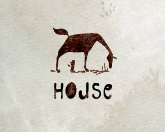
Ho?se
Status:
Just for fun
Viewed:
10502
Tags:
house horse
Share:


Lets Discuss
Very cool! Very nice!
Replycleber thank you!
ReplyIncredibly clever, Larisa! Wouldn't it be better to set a normal O, not a filled one? You already have that trick with R & U. I think that's just enough for the logo.
Replyu_ferret Nikita thank you very much! maybe you're right)
ReplyReally fun. Have you thought about the tail as smoke from chimney, it's almost there?
ReplySuper clever!
ReplyThanks a lot guys! yes, the tail like a smoke ))
ReplyThis is nothing short of brilliant. Love it!
ReplyIngenious in so many ways.
ReplyOhh, great, it's really cool, congratulations for featured gallery Larisa :-)
Replybest!
Replymany thanks! )))
ReplyFirst I thought it's a Horse feeding himself!
ReplyAmazing..two in one logo. Congrats.!
Replyso nice !
ReplyExcellent Job!
ReplyThe first animal I noticed after house, was Giraffe! but then I saw the ho?se and realized that it is supposed to be horse. Perfect use of creativity techniques.
I'll look for more works from you larlap.
Extremely good!
Replyyes, indeed! So clever
ReplyGreat work, can be interpreted alot of ways )
ReplyJust for fun but really cool
ReplyPlease login/signup to make a comment, registration is easy