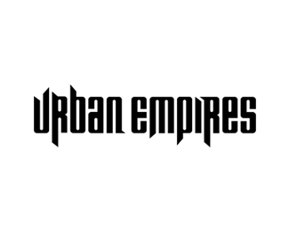
Reimagine
by KultHouse • Uploaded: Nov. 14 '07

Float
(Floaters:
4 )
Description:
A custom ambigram I designed for a new media upstart. Has a "legendary" and rustic aesthetic. Enjoy.
Status:
Nothing set
Viewed:
1871
Share:


Lets Discuss
Damn not bad. The N is a little tough to see. But overall I applaud this. One area I still have not tried.
ReplyI would never be able to read this if you hadn't told me what it says. And I can usually figure them out pretty quck. The overall look %26 shapes are nice, but I don't think people will get it without a tagline underneath.
ReplyAgree with amy.**I love this but couldn't read it at all. **Technically I think its amazing but with any logo legibility must come first.
ReplyWOW! So hard but so beautiful!
ReplyThis isn't a *brand* name that will be advertised and distributed and plastered on public works. The legibility of the logo (which varies for everyone) isn't quite relevant. It's a media agency with select client%E8le who are already aware of the company. The symbol represents the company, but its purpose isn't a promotional one.
ReplyHmm..interesting Kult. First of all, nice work. The technicality of this design is amazing. But isn't it an important rule of an ambigram design, legibility?
ReplyPlease login/signup to make a comment, registration is easy