
Description:
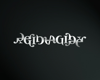
Redesign of a risk-management company's corporate identity. The mark is a very abstract rendition of the initials "iog" combined into one compact shape, and then rotated.
The slight resemblance of a razer gives the impression of cutting-edge service.
As seen on:
IOG Redesign
Status:
Nothing set
Viewed:
2141
Share:


Lets Discuss
Dude Kult this is awesome! I love it.
ReplyExcellent, thanks!
ReplyI completely see all the inspirations you intend on showing- so in that sense it looks very nice. However, the razor kinda links me to suicide... which seems pretty anti-intelligent. Take it for what you will.
ReplyThis rocks, Josh.
ReplyPlease login/signup to make a comment, registration is easy