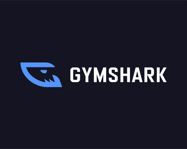
Gymshark logo concept
by Kreatank • Uploaded: Sep. 01 '20

Float
(Floaters:
2 )
Description:
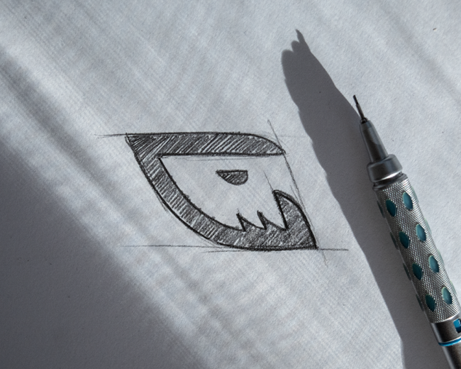
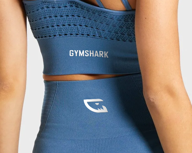
I always liked the negative space shark idea in the Gymshark logo but I'm not a 100% fan of the execution. I feel like it's slightly outdated but with a few simple changes, it could look awesome and still be recognizable by the audience.
What do you guys think & which one do you like more?
As seen on:
Gymshark logo concept
Status:
Unused proposal
Viewed:
4,860
Tags:
•
workout
•
creative
•
gym
Share:


Lets Discuss
Please login/signup to make a comment, registration is easy