Description:
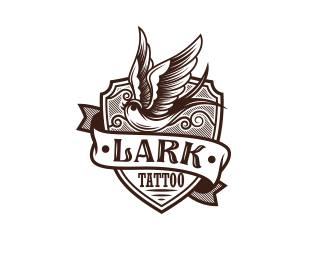
Lark Tattoo
As seen on:
Lark Tattoo
Status:
Unused proposal
Viewed:
10861
Tags:
Bodea Daniel
•
•
sparrow
•
emblem
Share:


Lets Discuss
Like it. think if you square up the banner and make LARK more even it would be better? Just my 2 cents. Nice artwork though.
ReplyThanks for the tips Logomotive and glad you like it. :)
ReplyI really like the swallow. Very nice!
ReplyThat swallow is beautiful.
ReplyI'd also be curious to see Mike's (Logomotive) suggestion. Especially since "TATTOO" is sitting on a flat baseline.
ReplyThanks Applex and Ocularink, I will try that version as well for sure.
ReplyYep... what they said above with the LARK text. Otherwise this is beautiful.
ReplyLike it as is, the text gives it that hand crafted kind of look to me, nice design!
ReplyThanks javaap, glad you like it. :)
ReplyI think the LARK text kills the hand crafted look because it feels it's orientation was limited by software rather than truly crafted to fit the flow.
ReplyPlease login/signup to make a comment, registration is easy