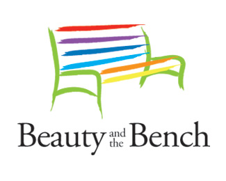
Float
(Floaters:
2 )
Description:
Logo for a community effort to improve bus stop benches with art work
Status:
Nothing set
Viewed:
2002
Share:




Lets Discuss
Watch the kerning, especially the EAU on Beauty.*Tighten everything up to read as a unit.
Replyditto with paul. kerning. not sure if i like the font choice or size of the text though.
ReplyUpper lower and all lower case on %22and the%22*Beauty and the Bench, same point size as you have it.*Tightly kern everything.*Make the bench black and have the ends connect more, touching and shrink it down a bit.
ReplyIn this case is the rainbow representative of the gay community?
ReplyI don't see how, the colors aren't in the right order. They barely make a rainbow (last two in wrong order even without the green between). Your not one of those who sees the gay flag in every rainbow are you? Must be your age...
ReplyThanks for the input, the logo is a pro-bono piece that I put together a little while back for a local effort to have artists paint the bus benches around town. The colors don't have any relation to the gay community. I think that this logo doesn't need to be one color, but if it needs to be used in a one color senario, the design can support it and replicate well. I agree that the type can be kerned tighter, and trying upper/lower case text may improve things as well. Thanks again guys.
ReplyPlease login/signup to make a comment, registration is easy