Description:
Someone I asked to create a logo for their business as a project for school.
Status:
Student work
Viewed:
1224
Tags:
Barber
Share:
Lets Discuss
Kickholas,
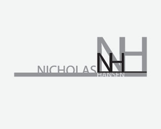
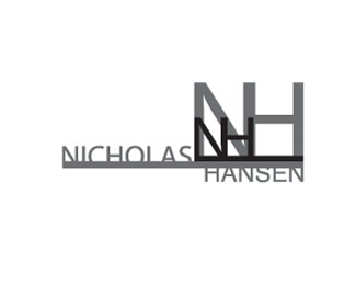
ReplyI feel that you are on the correct track with this logo, do I think it is there yet?... No but I like the direction. The first thing that I see it that this logo is not simple and will not reproduce well at a small size. Too much detail! Second, the style of the font doesn\'t match the rest of the logo. Overall it doesn\'t feel like a barber shop, but some sort of technology company.
Clever, I see the image of hair and combs.Good choice of font. The simplicity of this design I think makes it versatile. In production.
ReplyOn the right lower side of the logo there is a line. I wonder if the is a cut mark or just a line. I\'m not clear on the purpose. of the line. Over all it is a clean well defined Logo.
i like the hair growing on the top and bottom. most barber shops offer a shave along with a hair cut, i would work gook for door sign. it would just take some time picking out the small pieces.
ReplyPlease login/signup to make a comment, registration is easy