WROCLAW AIRPORT
by Karoles • Uploaded: Jun. 25 '13 - Gallerized: Jun. '13

Float
(Floaters:
53 )
Description:
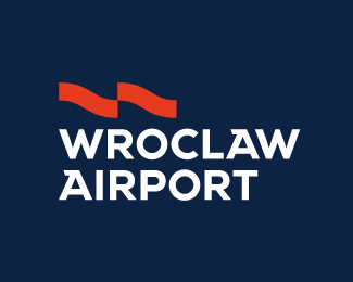
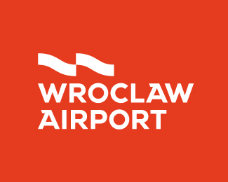
Project for contest WROCLAW AIRPORT
Logo define two overlapping wavy lines. It is a direct a reference to the architecture of the Airport, which has a unique rippling roof. In the central part of the sign you can see the subtle a reference to the "Chessboard air"-traditional Polish Aviation. With its simple yet powerful expression of well characterized by the lightweight multi-piece construction of the terminal. Logo perfectly harmonizes with form of Airports, which contained the character arcs and perpendicular lines. Was emphasized, as the function itself airport, arrivals and departures of aircraft. The whole logo was closed in a simple and readable form.
Status:
Unused proposal
Viewed:
12049
Tags:
krs
•
karoles
•
Airport
•
Wroclaw
Share:


Lets Discuss
Mocny znak
ReplySaw this earlier on Behance, nice presentation!
ReplyAlso came across this on behance. Great branding
ReplyJest super.
ReplyNice. Clean, simple.
Replydobra robota.
Replyreally well done
ReplyThanks Guys and thanks for being gallerized!
ReplyHad a look at behance, very good work!
Replydobre to redable :)
ReplyPlease login/signup to make a comment, registration is easy