Description:
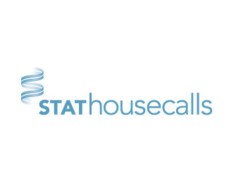
identity for medspa that offers a wide variety of skin treatments from spray tan to laser skin resurfacing
Status:
Client work
Viewed:
4622
Share:


Lets Discuss
I like it. Nice use of type and color, KGB.
Replythank you.
ReplyNice type KGB!
Replyvery nice and clean feel.
ReplyI'm thinking about make the ascenders taller. What do you think?
ReplyThe d could take a little movement but the k is spot on, so on balance I think I'd leave it alone. Cool.
ReplyNice and clean. Excellent choice of type (which is?).
ReplyIt's a modified version of Omnes from Joshua Darden.
Reply%3Ci%3EI'm thinking about make the ascenders taller. What do you think?%3C/i%3E**Yes, i think it give a elegant touch.
Replymay not work - but how would the d ascender look as a hair? just a slight bend and taper to a point. hard to tell without trying it - but might add a little more character to it..?
Replyif i may suggest, i won't make the ascenders any taller, it's perfectly balanced now.
Replysuggestion are always welcome.
Replywell, in that case i definitely suggest you not to change a thing in it. :)
ReplyI like it. Your attention to detail is good. However this is not that engaging. Maybe it's not supposed to be. Some of your other work is more conceptual I like them better. I still floated it. :)
ReplyPlease login/signup to make a comment, registration is easy