Float
(Floaters:
43 )
Description:
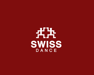
Two dancing figures were created to form Swiss symbol .
Improved .
Status:
Just for fun
Viewed:
5516
Share:


Lets Discuss
Waiting for comments !
Replythis is fun, i like the concept.
Replyc o o l ... l i k e i t !
Replythank You ! :)
ReplySince this is SWISS, Helvetica would probably be a better choice for the font. It's fun and clever though.
ReplyAnother Cheers mate!
Replyglad u like it !! :))
Replyactually i like the other version of this logo with bolder figures . What do you think ?
ReplyWhat about g spot for this clever design?
Reply%5E agreed!
Replyswiss egyptian? i like it
Replyhehe ! actually it was not about Egypt , but i agree , it commemorates a bit their national dances :D ! Thanks for the float guys !
ReplyAgreed with @action, smart enough to be there, any critique, nope*the symbol%B4s looking flawless, maybe another typo a bit more*squared and I%B4d give more importance to the symbol so the typo can*be reduced in size so the symbol will impact at first look.**Added to Favs too! Congrats.
ReplyFantastic man!
ReplySwiss Dance Dance Revolution Style! :D
Replythanks !
ReplyGreat idea and execution!*I just think that swiss cross has equal thickness on all sides and your left and right sides are thinner than top and bottom.
Replyhmmm , i think that it is pretty much the same :D Now i have no possibility to testi it out :)
Replyjust improved proportions of the cross !
Replyhaha, brilliant!
Replygreat!*
Replythaks %3B%5D !
ReplyReally nice work. I love it.
Replylike it a lot, id like to see if the dancers kind of became more fluid or smooshy (softer edges) would the mark still hold? maybe softer around the edges and crisper in the center to maintain the swiss mark? just a thought. i think the straight line dancers remind me of something not very swiss.
Replythanks thanks and thanks again ! Appreciate your feedback !
ReplyPlease login/signup to make a comment, registration is easy