
Description:
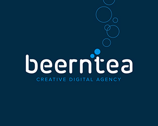
Logopond upgrade concept.
I think the current Logopond-concept shouldn't be re-newed. It's a well known platform and I think this small changement on the logo should be a good upgrade. Not sure this is the ONE, but it felt right to make something like this.
Would love to hear your thoughts on this concept.
As seen on:
www.dribbble.com
Status:
Work in progress
Viewed:
4181
Tags:
pond
•
redesign
•
branding
•
identity
Share:





Lets Discuss
Jeroen, I love this concept, nicely done!
Reply@xDick thank you for your creative support!
Replyinteresting version ! )
ReplyPlease login/signup to make a comment, registration is easy