Description:
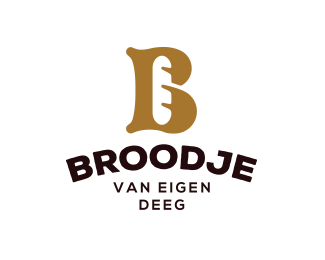
B for bakery. Identity concept for a Bakery in the Netherlands.
As seen on:
www.dribbble.com
Status:
Work in progress
Viewed:
12516
Tags:
bake
•
french
•
bakery
•
bake
Share:



Lets Discuss
Clever use of negative space. Looks great!
ReplyDoes look great yes. Nicely done.
ReplyThanks guys! Highly appreciate your kind words!
ReplyA bit reminds me "la brea bakery"
ReplyReally great work, I like it :-)
ReplyThis is very good idea.
ReplyTop man!
ReplyThank you @Vasvari @xDick and @BuroBlauwBrug
Reply@Logtek yeah, heard that one a couple times now. It was really a coincidence that this concept already was out there. But the final execution is way more different. So I don't see a problem here. Thank you for the heads up though! :)
Love this one too. I would get my bread from here for sure.
ReplyWhat an awesome solution to that B!
ReplyCongrats on the feature, Jeroen! Well deserved.
ReplyThank you so much @ru_ferret I'm so exited to saw my name up there this morning! Feeling really happy!
ReplyYes, I also saw la brea bakery in my grocery store this week and immediately thought of this mark I saw beforehand. Nice concept. Congrats on the feature!
ReplyThank you @Campfire for your kind words! I think they sure can co-excist. During my research I've found some similar concepts but none of them are exact the same in execution. When we make minimal design there is always a huge chance that some stuff already has been done before.
ReplyPlease login/signup to make a comment, registration is easy