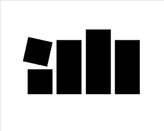
Description:
In 1980, my first year out of college, ad agency owner Al Bauer asked me to design an abstract icon to identify his firm. Early in the process he selected this design - which most likely evolved out of my interest in the minimalist logo imagery I studied in school during the 1970\'s - thinking it represented how advertising was orderly until something went completely out of whack. About a week later he realized it was very abstract lower-case a and b letterforms.
As seen on:
Creative Latitude
Status:
Nothing set
Viewed:
8121
Share:


Lets Discuss
I love this. It's really great.
ReplyI love it.the second lecture logo always amazed me.
ReplyPlease login/signup to make a comment, registration is easy