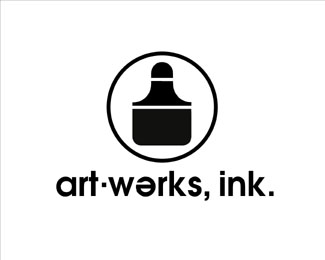
Description:
An early logo for myself, with an India ink bottle graphic incorporating the letterform 'A.' It served as an umbrella identity for my design work, commissioned ink line illustrations, and silkscreen prints being sold in art galleries.
As seen on:
bLog-oMotives
Status:
Nothing set
Viewed:
5048
Share:

Lets Discuss
I got that it was an ink bottle. However, I don't see the %22A%22 in the ink bottle graphic. It also feels very dated/old fashioned. Sorry.
ReplyThe negative space created by the top half of the bottle is the 'A.' It IS old-fashioned - it was designed about 1980 when I was doing graphic design with India ink from a bottle using ruling pens, paint brushes, pens with calligraphic nibs, and rapidiograph pens. Yes, I am a design-o-saur!
Replyi think you lost him wth all that latin jeff.. 'paint' 'brushes' 'pens'... its a very old language... i like this though, very nice:)
ReplyLOL! Thanks nido...yes, I do realize it's ancient history.
ReplyI've done my share of past-up boards in my day (pre-Mac) and I do own a ruling pen and an extensive collection of dusty Rapidiographs as well. So I am speaking the same ancient language. Now that you've attached a date to the design the dated look makes much more sense. Thanks.
ReplyFor me this looks like the most modern piece of Jeffs portfolio. In putting an %22A%22 in the design it would require also a %22W%22 to stay uniform and I think you were'nt far from that.
ReplyNot putting a 'W' in the design was intentional as 'art-werks' was not intended to be two words - it is simply a graphic phonetic representation (with a bit of 'creative license') of the single word 'artworks,' just as 'ink' also referred to 'inc.'
ReplyFair enough. There is also the issue of symbolising a lower case title with a capital %22A%22 but in fairness it is an early piece. :%5E)
ReplyAnyways, having some ancient design experience as well, I don't think a mark or symbol 'always' has to contain dead-obvious (pairs of) characters. Like this example, the A serves another more important purpose.**On another note, to me it kinda has a German typographic style, which I think is a good thing.
ReplyPlease login/signup to make a comment, registration is easy