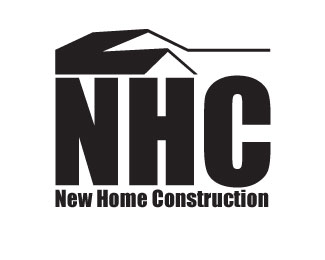
New Home Construction
by J_Ben_A • Uploaded: Nov. 03 '10

Float
(Floaters:
0 )
Description:
This is my construction logo. What do you think?
Status:
Student work
Viewed:
791
Share:


Lets Discuss
J_Ben_A,*This logo really needs some work. First, logos have to be stand alone to be successful. You cant rely on %22bleeds%22 to hold the weight of your logo, in this case the mountains form the edge of the logo. The font is no good (not a good choice). Overall I think this logo could be pushed further.
ReplyI feel the house is the logo and the surrounding elements are extra. The mountains don't seem to fall into place. The font doesn't have the feel to fit the house as well. I do think that it could be successful with some changes.
ReplyI think you could make an more of a house outline and maybe illustrate some simple (very) mountains that gently contour the roofline of the house. Then i thought you could go with a cleaner font like helvetica etc...
ReplyPlease login/signup to make a comment, registration is easy