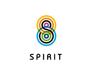
Spirit
by Hiro • Uploaded: Mar. 07 '08 - Gallerized: Mar. '08

Float
(Floaters:
29 )
Description:
draft for an advertising agency
Status:
Nothing set
Viewed:
10064
Share:


Lets Discuss
very clever
ReplyGo back to the first version with the many colors. That one's way better.
ReplyThis is great.
Replyamazing ))) very clear and nice!
ReplyWOW!! Logotypes have got to be one of the most difficult types of projects. This is so stylish and so fitting for the name. Fantastic job!!
ReplyThank you guys!
ReplyAmazing work! So subtle and impressive! Love it!
ReplyYeah, this is nice. And different, too.
ReplyGreat solution. I'd kern the S closer to the p though. just a thought.
Replyi like it much!
Reply.........fresh!.........
Replyahh so lovely
ReplyIncredible.
ReplyExcellent work!
ReplyPlease login/signup to make a comment, registration is easy